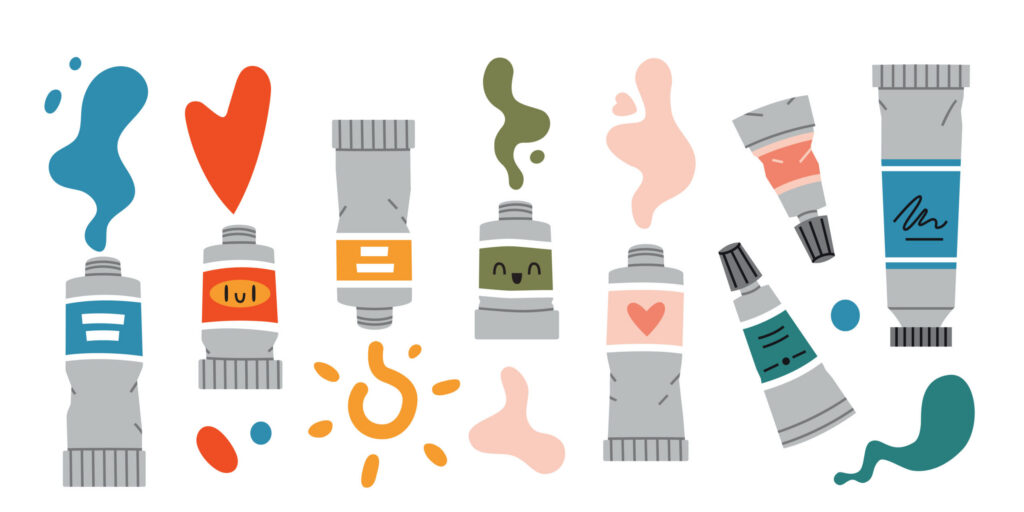
Color Temperature is a vital element of Color Harmony, corresponding to the perceived warmth or coolness of a color. Shifting the color temperature within a palette can dramatically influence the mood and perception of a brand or design
Warm Colors
Warm Colors are inspired by elements like fire, sunsets, and autumn leaves, and are known for evoking emotions such as passion, comfort, and excitement. Red, orange, and yellow are the most commonly recognized Warm Colors.
Using a Warm Color palette can be very effective in branding and web design. For example, red is often used to create a sense of urgency and prompt immediate action, making it ideal for highlighting calls to action. Retailers frequently ushered for clearance signs, drawing shopper’s attention to sale items and creating a sense of excitement and urgency.
On the other hand, yellow evokes feelings of optimism and happiness, making it a perfect choice for brands that want to appear cheerful and welcoming.

Cool Colors
Cool Colors take their cues from natural elements like the sea, sky, and grass, and are associated with feelings of calm, trust, and relaxation. The most commonly used Cool Colors are blue, green, and purple.
A Cool Color palette is particularly useful when you want to foster a sense of peace, focus, or professionalism. For instance, blue is frequently chosen by brands that aim to convey trust and stability, such as those in financial or legal services. Meanwhile, green is ideal for brands that emphasize nature, health, and sustainability.

Let NextGen Help
Selecting the right Warm or Cool Color palette, while understanding their psychological effects can be instrumental in developing a strong brand identity that aligns with your company’s values and objectives. NextGen’s Digital Team understands color theory and its implications for various platforms of digital media, which we can adapt to your goals.
Interested in learning more? Take a deeper dive into Color Harmony and Color Schemes– or connect with the experts at NextGen.

