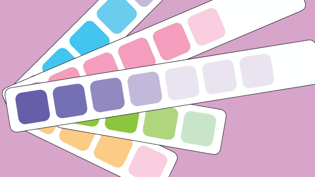
Color schemes are intentional combinations of colors that create harmony and balanced design based on their placement on the color wheel.
Monochromatic
A Monochromatic Color Scheme revolves around a single base hue, with variations achieved by altering lightness or darkness through the addition of black (to create Shades) or white (to create Tints). This approach allows for a visually cohesive and harmonious design that naturally establishes a sense of hierarchy.
Monochromatic schemes are particularly effective when a strong, singular hue is central to your brand identity as they provide consistency and focus. However, to ensure an effective monochromatic scheme, it’s crucial that each Shade and Tint is distinct enough to be easily perceived by the viewer. This differentiation helps maintain visual interest and prevents the design from appearing flat or monotonous.

Analogous
Analogous Colors are next to each other on the color wheel, such as yellow, orange, and red. These colors naturally appear harmonious because they share a common base hue. Analogous Schemes are often found in nature, making them pleasing to the eye and effective in evoking a sense of balance and comfort.
Analogous color schemes create a calm, natural feeling in your design. Additionally, they highlight content without overwhelming the viewer by adding subtle interest to your color palette while staying true to your main brand colors.

Complementary
Complementary Colors are positioned directly opposite each other on the color wheel, such as orange and blue. Unlike Analogous Colors, Complementary Colors do not share a similar hue, and produce a strong contrast when paired together. This high contrast makes the colors appear more vibrant and dynamic by drawing attention to the elements they highlight.
Complementary Color Schemes are useful for creating visual interest as they make elements stand out. They are often employed in brand identity to make a striking impression or to draw attention to a call to action.
For best results, it’s important to balance the main hue with its complementary color by using the complementary color primarily as an accent so as to maintain visual harmony and avoid overwhelming the viewer.

Let NextGen Help
NextGen’s Digital Team understands color theory and its implications for various platforms of digital media, which we can adapt to your goals. Interested in learning more? Take a deeper dive into Color Harmony and Color Temperature– or connect with the experts at NextGen.

